Skip to content
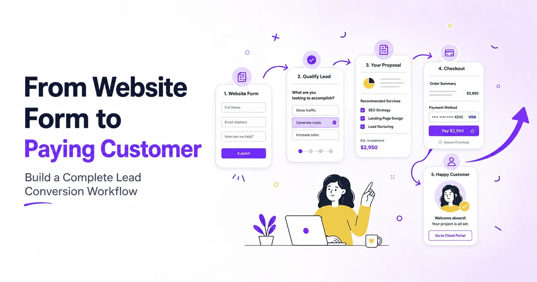



Someone fills out a form on your site. Ten minutes later, they’ve forgotten your company exists. This happens thousands of times a day, and most businesses never notice the pattern because they’re tracking form submission counts instead of bank deposits.
A lead conversion workflow fixes that blind spot. Picture it as a relay race:
- Marketing hands off the baton to sales
- Sales hands it to follow-up
- Follow-up carries it across the finish line
Drop the baton anywhere in that chain, and the lead goes cold.
The difference between businesses that grow and ones that stall is that the growing ones map every handoff, assign an owner to each step, and measure where prospects actually disappear. The stalling ones just buy more ads to fill a leaky bucket.
This article walks through building that workflow, stage by stage, with real companies showing how each piece works in practice.
Capture the Information Needed for Effective Follow-Up
A basic contact form tells you a name and an email address. It doesn’t tell you what to do next. That’s the question most forms leave unanswered, and it’s why so many “new leads” sit untouched in a CRM for three days before anyone reaches out with anything useful to say.
That’s why you need to treat your form as a triage tool, not a mailbox. Every field you add should reveal what the person on the other end needs to hear from you first.
The goal is to create a sharper form, not a longer form. You should build around three or four questions that let your team avoid speculating and open the conversation with something specific and useful to that exact prospect.
So, start by listing the first three questions your sales or support team asks on every single call. Those questions belong on the form itself, not buried inside a follow-up conversation days later. Then test the form’s length. If a field doesn’t change how someone on your team will respond to that lead, cut it entirely.
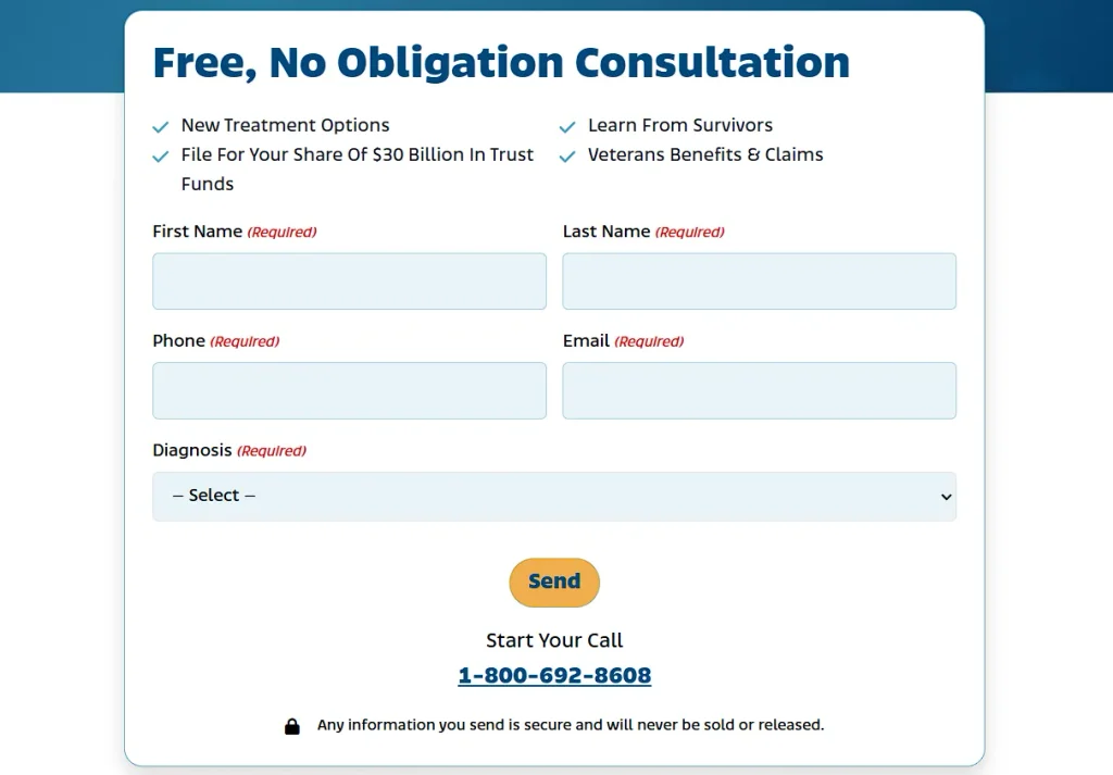
A company that puts this into practice is Mesothelioma, a site that connects patients and families affected by this rare, asbestos-linked cancer with free guidance and resources.
The form on their consultation page asks about diagnosis details before anyone submits a request. That single addition means a patient advocate can open the first conversation already familiar with the person’s stage and situation, instead of starting from scratch.
For a visitor dealing with a serious diagnosis, this means the difference between a generic reply and a response that actually addresses where they stand.
Offer Different Conversion Paths for Different Visitor Intent
Not every visitor on your site wants the same thing. Some are ready to buy today. Others just want a resource to read on their lunch break. When you funnel all of them toward one form, you lose buyers to friction and annoy researchers with a pushy request.
The fix is to sort visitors by intent and give each group its own path. A visitor who lands on a pricing page is closer to a decision than one reading a blog post, so treat them differently.
- Offer a free trial or demo booking to people showing buying signals.
- Offer a gated guide or newsletter signup to people still exploring.
- Offer a “Contact Sales” option for visitors with complex needs who won’t self-serve through a signup flow.
To put this into practice:
- Map out where each type of visitor lands on your site and what they’re likely trying to accomplish there.
- Build a matching CTA for each stage, rather than repeating the same “Get Started” button across every page.
- Keep the form length tied to intent too. The closer someone is to buying, the less friction their form should have.
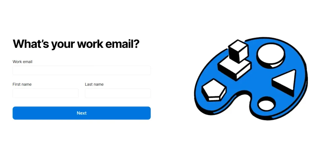
Notion, a workspace app that combines notes, project tracking, and team collaboration, handles this well on its homepage.
Visitors see two CTAs side by side – one to sign up for free, another to request a demo. The signup path only asks for a work email, since that visitor has already decided to try the product. However, the demo path asks for a work email and full name, since that visitor needs a human conversation before committing.
Each path matches what the visitor wants at that moment, not what’s easiest for Notion to track.
Use Interactive Tools to Guide Visitors Toward the Right Solution
A blog post tells a visitor what to think, while an interactive tool asks a few questions and hands back an answer built just for them. That switch, from reading to responding, changes how visitors experience your site and how likely they are to actually act.
The mechanics stay simple across all formats, whether that’s quizzes, assessments, configurators, or recommendation tools. A visitor answers a few questions, the tool processes those answers, and it returns a recommendation paired with a clear next step.
The payoff shows up in the numbers too. Interactive content generates 52.6% higher engagement than static formats like articles or product pages, and it produces roughly twice as many conversions.
Visitors stick around longer when they’re getting something personalized back, and they’re more willing to hand over contact details once a tool has already given them something of value.
To build one for your own brand:
- Start with a question your customers already ask you directly, like “Which plan fits my needs?” or “What’s causing this problem?”
- Turn that question into a short series of inputs.
- Map each outcome to a specific product, service, or piece of content.
- Keep the question count low. Five or six is usually enough to produce a useful result without exhausting the visitor.
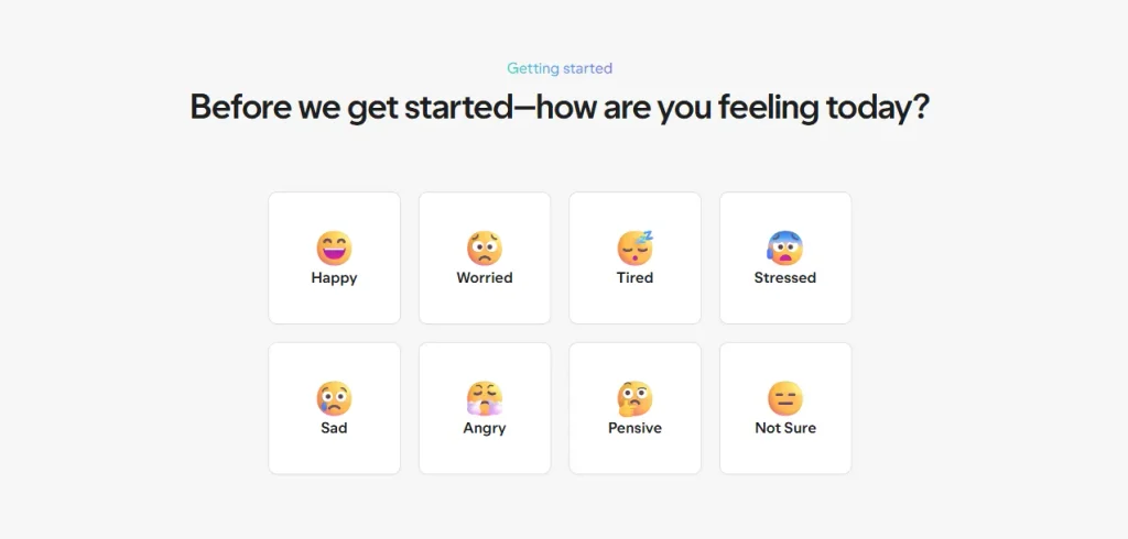
Hims, a telehealth platform that connects users with licensed providers for remote consultations and prescriptions, runs several of these tools across its site.
Its mental health assessment screens users for symptoms tied to conditions like anxiety and depression. Once someone completes it, a licensed provider reviews the answers, and the platform follows up by email with tailored recommendations.
This turns a quiz into an actual clinical next step.
Let Purchase-Ready Visitors Skip Unnecessary Lead Capture
Not every visitor needs to be treated like a lead. Someone who already knows what they want to buy doesn’t need a form, a follow-up call, or a wait for a sales rep. Forcing that visitor through the same process as an undecided browser adds delay that serves your CRM more than the sale itself.
Self-service checkout solves this by letting purchase-ready visitors skip straight to payment. The logic is simple – if a visitor already knows the product, the price, and the terms, the only thing standing between them and a completed sale is how many steps you put in front of them. Cut those steps, and you cut the number of people who abandon the process out of frustration.
The impact on revenue is measurable. Optimizing the checkout flow, removing extra fields, cutting unnecessary clicks, and simplifying payment entry can lift conversion rates by 35%. That gain comes from visitors who were already sold, not from convincing new ones.
To apply this:
- Look at which products or services people buy without needing a conversation first.
- Build a direct path to checkout for those offers.
- Reserve the full lead-capture form for options that genuinely require a sales discussion.
- Test your checkout for friction the same way you’d test a lead form. Count the fields and clicks, and remove anything that isn’t essential to completing the purchase.
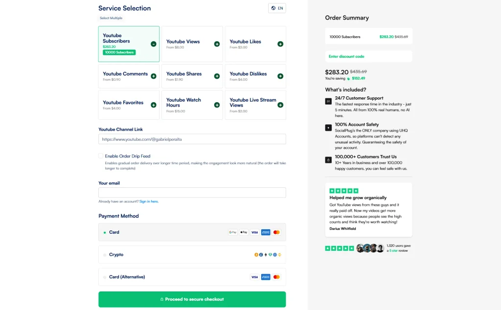
Socialplug, a marketplace where customers buy followers, likes, views, and comments for social media accounts, built its checkout around this principle.
Visitors can pick the service they want and land directly on a checkout page. From there, they can add extra services, enter their email, and submit payment.
They can do all of this within roughly 30 seconds without ever filling out a traditional lead form.
Tell Leads What Happens After They Take the Next Step
Hitting “Submit” on a form is a small leap of faith. The visitor hands over their information without knowing what happens next, who will reach out, how soon, and what that first contact involves.
When that uncertainty lingers, some prospects hesitate before submitting, and others submit and then quietly disengage while they wait for a response that never comes.
Telling leads exactly what happens next removes that uncertainty. A simple confirmation message can cover who will reach out, through what channel, and within what timeframe. It can also outline the steps that follow, whether that’s a phone call, a personalized recommendation, or a document to review before a first meeting.
None of this requires new infrastructure. You just need to write down a process that your team already follows and show it to the visitor at the moment they need it most.
To put this into practice:
- Map out every step that happens internally after a form gets submitted, from the first internal notification to the moment a prospect hears back.
- Turn that internal map into a short, plain-language summary for the confirmation screen or email.
- Include a specific response window instead of a vague promise like “shortly,” since specific numbers build more trust than general reassurance.
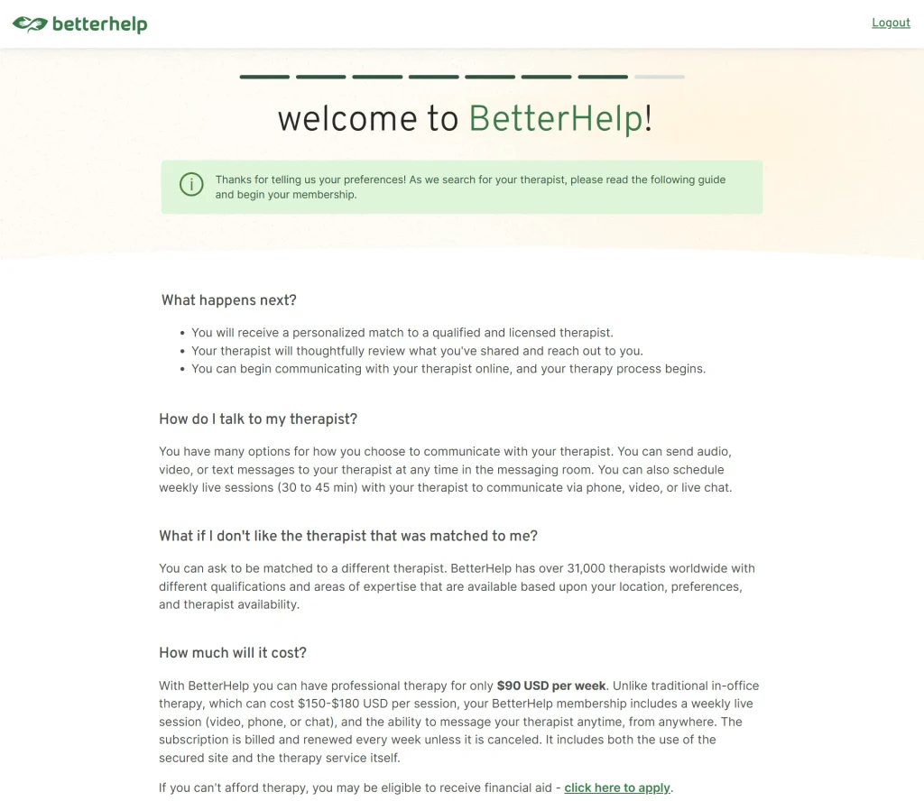
A company that does this after their initial questionnaire is BetterHelp, an online platform that matches people with licensed therapists and counselors through web and mobile sessions.
Once someone answers questions about their mental health, the final screen lays out what comes next. It tells them that they’ll get a personalized therapist match, guidance on how to start that first conversation, information on how to switch therapists if the match isn’t right, and what membership will cost them.
This leaves prospects with a clear picture of the road ahead, not an open question.
Nurture and Prioritize Leads Based on Purchase Readiness
A lead who requested pricing is different from a lead who downloaded an ebook six months ago. If you treat these leads the same way, your sales team will waste time on people who’re not ready to buy. You will also frustrate leads who receive sales pitches too early.
The next step in your process should be based on how ready a lead is to purchase, rather than the simple fact that they submitted a form.
High-intent signals deserve fast, direct attention. A visitor who requests a demo, asks for pricing, or abandons a checkout page is telling you that they’re close to a decision. So, a sales rep should reach out quickly while interest stays warm.
Lower-intent leads need a different rhythm, like a sequence of emails, occasional texts, or relevant content that keeps your business visible without pushing for a sale they aren’t ready for.
To build this into your workflow:
- List the actions on your site that signal real buying intent, like pricing page visits, demo requests, or repeat visits within a short window.
- Assign those actions higher priority than passive ones like a single blog read.
- Route high-priority leads straight to a rep, and set lower-priority leads into an automated nurture sequence that checks in on a schedule rather than all at once.
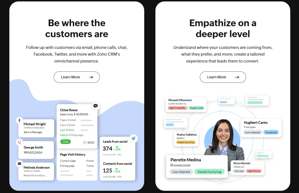
For a closer look at how lead scoring and nurturing systems work in practice, Zoho’s CRM offers a useful reference point.
It pairs customizable, rules-based scoring with AI-driven insights, so leads get scored accurately and routed into automated nurturing workflows without manual sorting. The platform connects with prospects through email drips, social media, live chat, and phone outreach, and it integrates with specialized tracking tools that update lead scores as engagement happens in real time.
This combination shows what a complete readiness-based system looks like once scoring, nurturing, and sales handoff work together.
Final Thoughts
Now’s the time to learn which stage in this workflow is costing you the most leads. Not which one feels broken, but the one where your numbers actually drop.
Pull up your analytics and look at drop-off rates between each step: form submission, first contact, and close. That number tells you where to start. Fix that single stage this month, then move to the next weakest point.
All you need is one honest look at where prospects are leaving, and one change that keeps a few more of them in the room.