Skip to content
  Get the best 3-year deal NOW →



A customer wants a canvas tote with their dog’s portrait printed on it, in two sizes, with a name stitched on the strap. However, somewhere between the first click and the checkout button, that customer closes the tab.
Custom orders require shoppers to make several choices, and every confusing input field increases the likelihood that they will abandon the purchase. Sellers lose these sales frequently, and the primary cause is typically the design of the order form.
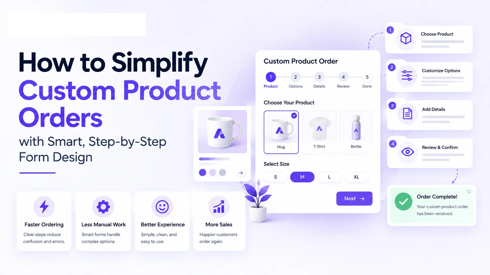
A well-designed form fixes this by breaking the order into small steps. Shoppers see what’s coming, choose options with visual help, and answer only the questions that apply to them. In turn, sellers receive complete details the first time, which cuts back-and-forth emails and production mistakes.
Below are six simple ways to build that kind of form. You’ll learn how to set expectations up front, use images and conditional logic, collect requirements in stages, accept flexible input, and show progress along the way.
Set Expectations Before the Customization Process Begins
A custom-order form works best when it opens with a short briefing. Customers should learn what the process involves before they see the first field:
- Tell them which materials to have ready (artwork files, measurements, a target quantity, a deadline, reference photos, or technical drawings).
- Explain what happens after they submit, such as who reviews the request, whether a quote follows, and how long a reply takes.
- Mention any minimum order size, deposit requirement, or production time that affects the decision to continue.
Shoppers who know these details can gather their files and numbers ahead of time. They can also judge early whether the project fits their budget and schedule, which saves time for both sides.
To implement this:
- Place a short introduction above the first field.
- Use a checklist of required items, and mark which ones customers can send later.
- State your minimum order, deposit, and typical timeline in plain numbers.
- Add a line that explains what happens after submission, including who replies and when.
- Keep the block to a few short lines so people read it.
- Offer file-upload guidance, such as accepted formats and size limits, in the same place.
- Test the wording with past customers and ask which detail they’d have wanted sooner.
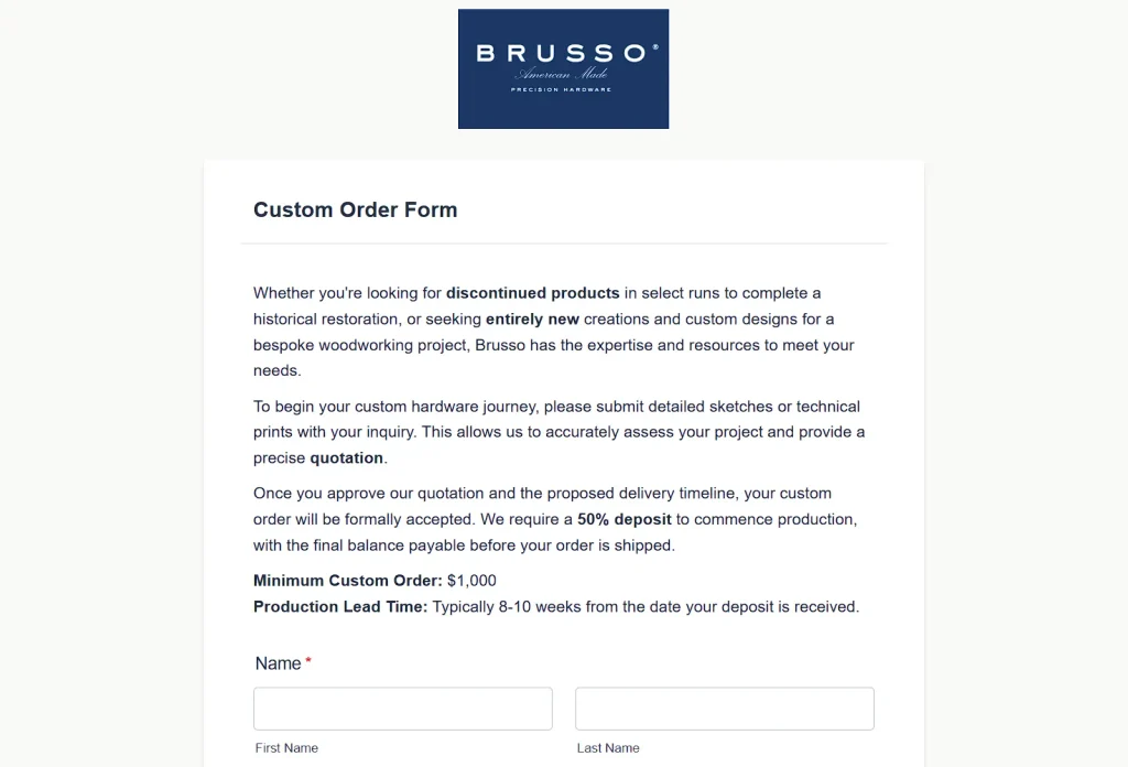
A neat example of how it’s done is Brusso, a maker of solid-brass hardware for woodworkers, cabinetmakers, and builders of furniture and keepsake boxes. Their custom-order form applies this approach.
Before fields appear, the page asks for detailed sketches or technical prints, which the company needs to assess the project and quote accurately. The form states that Brusso accepts an order only after the customer approves the quotation and proposed delivery timeline.
They also list the minimum order amount, a 50% deposit to begin production, and the typical production lead time after the deposit arrives.
Use Product Images to Make Customization Choices Clearer
Text descriptions ask customers to imagine a product, and each person imagines something different. Images show everyone the same thing. Placing a photograph, illustration, or size reference directly beside each option can help customers see what they’re choosing at the moment they choose it.
Product type and style choices gain the most, because labels such as “Slim” or “Classic” mean different things to different people.
Size choices need the same treatment. Shoppers who compare each size option to a visual reference, such as a hand, a desk, or a standard object next to the product, understand the sizes better than shoppers given measurements in inches alone. That clarity can reduce size-related returns.
To implement this:
- Start with the choices that cause the most confusion, usually type, style, and size.
- Add a clear photo or illustration to each option and label it with a short name.
- Show sizes on a real reference, such as a hand or a standard object, and place the actual measurements beneath it.
- Consistent image dimensions and lighting make options easier to compare.
- On mobile, let customers tap an image to enlarge it.
- Ask a few test customers to pick a size using only the visuals.
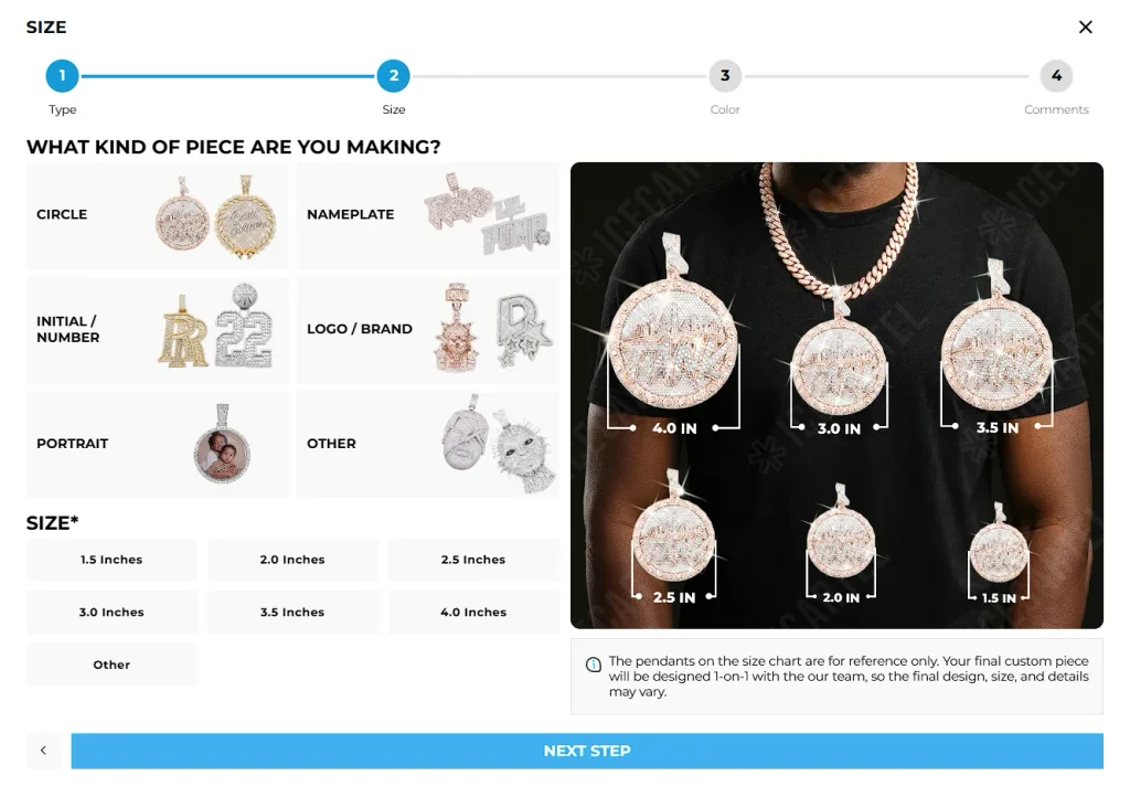
Icecartel, a moissanite jewelry brand for men, has a custom jewelry form that builds every step around visuals.
Customers pick product types and pendant styles from images. The size screen displays the same style of piece in different real sizes, so shoppers see exactly what they’ll receive. Because every option appears as a picture, customers can decide without decoding descriptions. The result is a clear form that helps prevent surprises at delivery.
Any brand that sells products with several sizes or styles can copy this pattern.
Use Earlier Answers to Control Which Questions Come Next
Conditional logic shows or hides questions based on what a customer has already answered. A customer who selects an engraving option sees engraving questions, and a customer who skips it goes straight to the next topic. Each person answers the questions that apply to their order, which keeps the form short for simple projects and detailed for complex ones.
A University of Maryland study compared several web-based questionnaire designs and found that an automatic item-by-item version with conditional branching was significantly faster than versions that displayed the broader questionnaire or automatically scrolled to the next appropriate question.
Faster completion helps custom orders, where every extra question raises the chance of form abandonment.
To implement this:
- List every question your form needs, then sort them by the answer that makes each one relevant.
- Choose a few branching points, such as product type, material, or whether the customer has artwork.
- Write a follow-up group for each option and name the groups clearly, so you can maintain them later.
- Questions your team always requires belong on every path.
- Test each route yourself and confirm that every path collects enough detail to start production.
- Review answers monthly and remove branches customers rarely use.
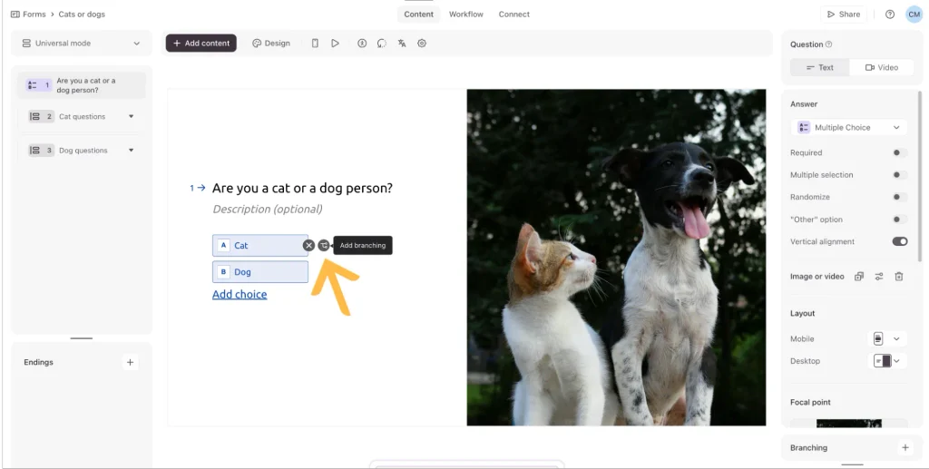
Typeform makes software for building interactive forms, surveys, and quizzes that present one question at a time. Its conditional questions and branching logic change a form’s path based on earlier answers.
One example starts with a multiple-choice question that asks respondents whether they’re a dog person or a cat person. The form contains one group of cat questions and one group of dog questions. Each answer sends respondents to the matching group.
A custom-order form can route customers to product-specific questions the same way.
Collect Detailed Project Requirements One Decision at a Time
A custom order requires many details, and seeing all of them on one screen can make the request look time-consuming. Progressive questions solve this by showing one decision at a time.
Quantity, product type, deadline, intended use, design preferences, artwork, and extras each should get their own screen. That way, customers can focus on a single choice, answer it, and move to the next screen. The form feels shorter, and it collects every detail the company needs for the order. Each answer also gives customers a small sense of progress, which encourages them to continue.
Easy questions early in the form prepare customers for harder ones about artwork and deadlines. Also, asking about name and email early on can help you capture leads even if prospects don’t complete the order.
To implement this:
- Sort your questions from easiest to hardest, placing quantity and product type at the start.
- Give each question its own screen and keep the wording to one short sentence.
- Turn fixed answers into buttons or image cards, and reserve text fields for details only the customer knows.
- Add a short note beneath a complex question to explain why you’re asking it.
- Let customers go back and change earlier answers without losing progress.
- Finish with a summary screen so they can confirm the full request before submitting.
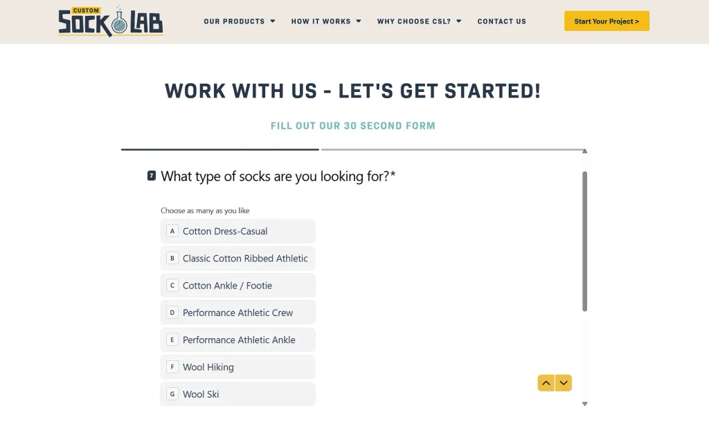
Custom Sock Lab produces personalized socks for businesses and private buyers, and its order form asks one question at a time.
Customers select answers from clearly listed choices for product type, purpose, design, and extra options. Each screen contains a single decision, so customers can complete the whole request at a steady pace.
Any brand with a long list of custom options, from ecommerce stores to service providers, can borrow this sequence.
Give Customers Flexible Ways to Explain Unique Requirements
Fixed choices cover the common options, but many custom orders include a request the form can’t anticipate. Open-text fields and file uploads let customers describe that request in their own words.
A text box can hold special requests, extra context, or notes about how the product will be used. An upload field accepts artwork, sketches, reference photos, and technical drawings that a customer would struggle to explain in words. Both field types work best after the structured questions, so the main form stays organized.
Structured answers give your team the basics, and the open fields supply the specific details that shape the final product. That way, customers can share exactly what they have planned.
To implement this:
- Keep required fields for essentials, such as name, email, and product type, and mark the open fields as optional.
- Label the text box with a specific prompt that asks for dimensions, materials, and finishing. A placeholder example shows customers what a useful answer looks like.
- State upload rules up front, including accepted formats, maximum file size, and file count.
- Confirm each upload on screen so people know the file arrived.
- Read the free-text answers each month and turn common requests into new fixed options.
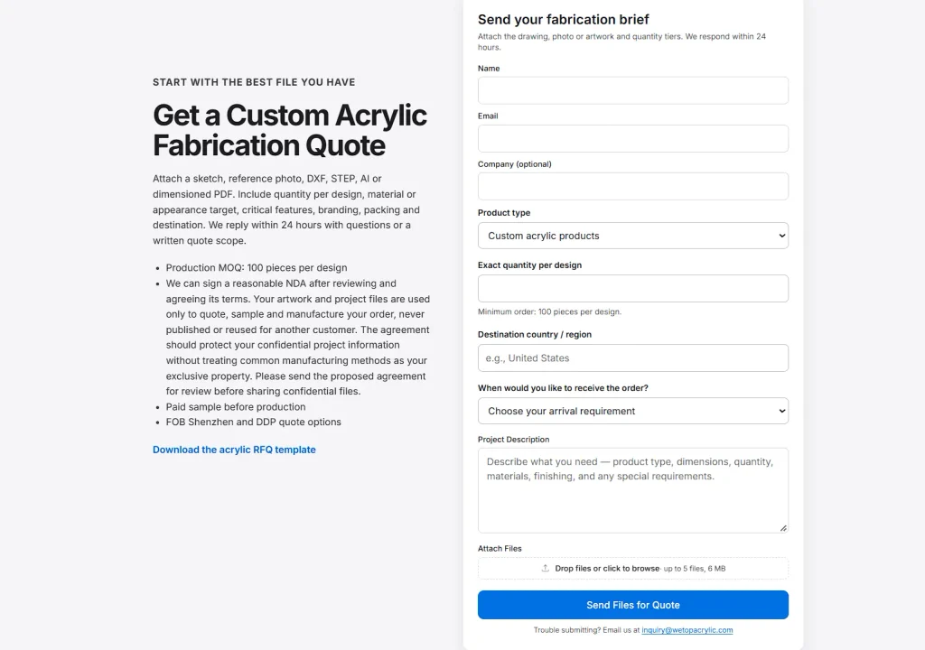
Wetop manufactures custom products from acrylic and plexiglass, and its ordering process combines structured fields with open ones.
The form includes basic fields such as name, email, and product type. A project description field then asks customers to describe what they need in more detail, including dimensions, materials, finishing, and special requirements. Customers can also attach sketches or reference photos to show their requirements more clearly.
This setup gives the company standard contact details and a complete description of each unique project it receives.
Show Customers Their Progress Through Longer Forms
Longer forms raise three questions for customers. Where am I, how much is left, and can I fix an earlier answer?
A progress indicator answers the first two questions. It shows the current step, the total number of steps, and how much work remains. Clear back and next buttons answer the third question, since customers can return to a previous screen, correct a detail, and continue.
The form should keep every entered answer while customers move between screens. Lost input forces customers to repeat their work, and some leave at that point.
Predictable navigation makes a long request feel manageable, because customers can see the full sequence before they reach the end.
To implement this:
- Number the steps and display the count at the top of every screen, such as step two of five.
- Use a progress bar for shorter forms and a step list for longer ones.
- Name each step by its topic, so customers know what’s coming next.
- Every screen needs a visible back button beside the next button.
- Save answers automatically, including partial entries and uploaded files.
- Offer a link that returns customers to the exact step where they stopped, in case they close the page.
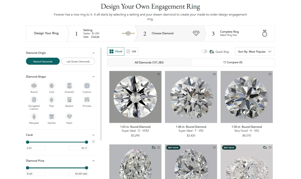
Brilliant Earth sells ethically sourced fine jewelry, including engagement rings, wedding bands, and custom designs. Its ring design tool lets customers build their own engagement ring in three main steps.
A progress bar sits above the design and selection area and shows which step the customer is on. This allows customers to see how far they’ve come and how much remains before they finish designing and ordering the ring.
The three defined steps give the entire process a clear start and a clear end.
Final Thoughts
Open your custom-order form today and count the fields on the first screen. Choose one change from this article, such as a short checklist at the start or a follow-up question that appears only when it applies, and implement it this week.
The share of customers who reach the submit button before and after the change shows whether it worked. Each result points to the next step that needs attention, and you’ll see the form improve with every round of edits.
Repeat the process until clarifying emails from customers become rare.